Why Responsive Web Design is Crucial for Your Business
Introduction
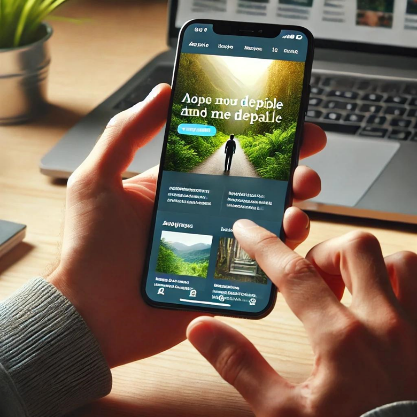
In today's digital world, a website is more than just an online presence—it’s a powerful business tool. With more than half of web traffic coming from mobile devices, having a responsive web design is no longer optional; it's essential. A responsive website adapts seamlessly to different screen sizes, ensuring a smooth user experience, higher engagement, and better conversions.
1. Enhanced User Experience (UX)
A responsive website ensures that your visitors don't struggle with tiny text, broken layouts, or horizontal scrolling. Instead, they get a seamless browsing experience, whether they're on a smartphone, tablet, or desktop.
Why these matters:
- Visitors stay longer on your site.
- Lower bounce rates.
- Higher chances of conversion (purchases, sign-ups, etc.).
2. Improved SEO & Google Ranking
Google prioritizes mobile-friendly websites in search results. If your site isn't optimized for mobile, you risk losing visibility to competitors who have responsive designs.
How it helps:
✔ Higher rankings on Google
✔ More organic traffic
✔ Better local search visibility
3. Faster Page Load Speeds
Speed is crucial. A responsive website is designed to load faster across all devices, reducing frustration and keeping visitors engaged. Google also considers page speed as a ranking factor, making responsiveness a must.
Did you know? A one-second delay in load time can decrease conversions by 7%
4. Increased Sales & Conversions
If users struggle to navigate your site, they’ll leave without taking action. A well-optimized, responsive design improves usability and increases the likelihood of visitors making a purchase, filling out a form, or contacting you.
Key benefits:
- Easier navigation = more conversions
- Optimized checkout experience
- Builds trust & credibility
5. Cost-Effective & Future-Proof
Instead of maintaining separate websites for mobile and desktop users, a responsive design ensures one adaptive website that works on all devices. This saves money, time, and development effort.
Future-proofing your business:
✔ Works on new devices (smartwatches, foldable screens, etc.)
✔ Adapts to future web trends
✔ Reduces maintenance costs
Conclusion
A responsive website is no longer a luxury—it’s a necessity for businesses that want to thrive in a mobile-first world. From better user experience to higher SEO rankings, faster speeds, and increased conversions, the benefits are undeniable.
Need Help with a Responsive Website?
At The Emperor Infotech, we specialize in creating high-performing, mobile-friendly websites tailored to your business needs. Contact us today to get started!
Latest Blogs
The power of logos: more than just a pretty picture

Why email marketing automation is a game- changer for businesses in 2025

Web design evolved: the impact of artificial intelligence
Why Responsive Web Design is Crucial for Your Business

PRODUCT REVIEWS: A POWERFUL TOOL FOR INFORMED DECISION- MAKING